Premium packaging that stands the test of time? C’est la vie!
When it comes to matters of the heart, let Laarvee capture yours.
Of Japanese origin, these pure pieces of sophisticated artistry scream elegance and luxury. The distinctive Dali-inspired design offers romance, authenticity and exceptional quality.
Tick follows tock, emulating a heartbeat, a pulse that represents the true essence of time, of life, together.
A moment in time, can lead to an eternity. So, when one wishes to present such a gift to the world, only one packaging partner will do.
ESKA. The persistence of luxurious sustainability.
True Love Matters
Timeless. Seamless. Priceless.
Quality products need quality packaging. The brands must merge, fuse and meld together forming a partnership which embraces elegance and yet has ethics built into its very core.
Laarvee collaborated with Pangolin Design, groundbreaking creative innovators spearheading sustainable luxury packaging.
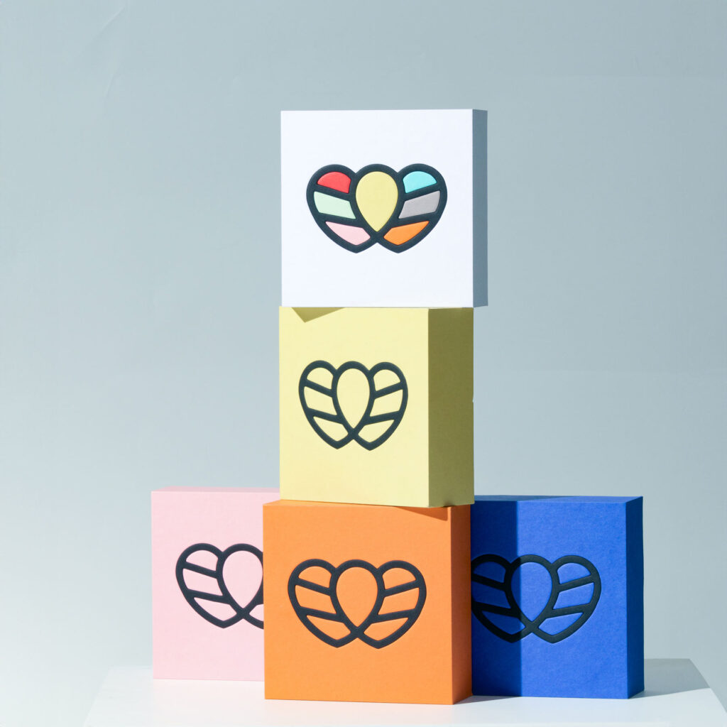
Both chose ESKA as their material of choice, naturally. ESKA Colours is an eco-friendly, high quality range of multi-coloured board, totally sustainable with a beautiful finish.
Wrapped around a piece of art so original, ESKA mirrors Laarvee’s minimalist, classic ethos of understated refinery, eco-responsibly.
A timepiece of exceptional quality captured forever.
Open up a world of ‘wow’.
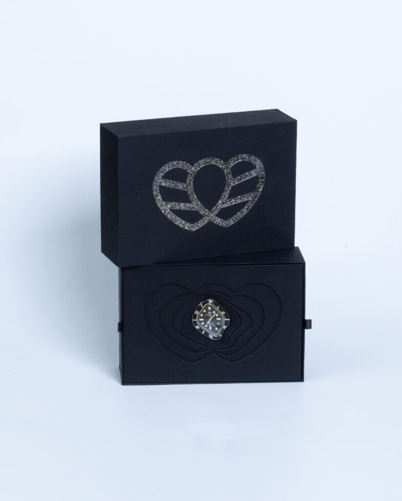
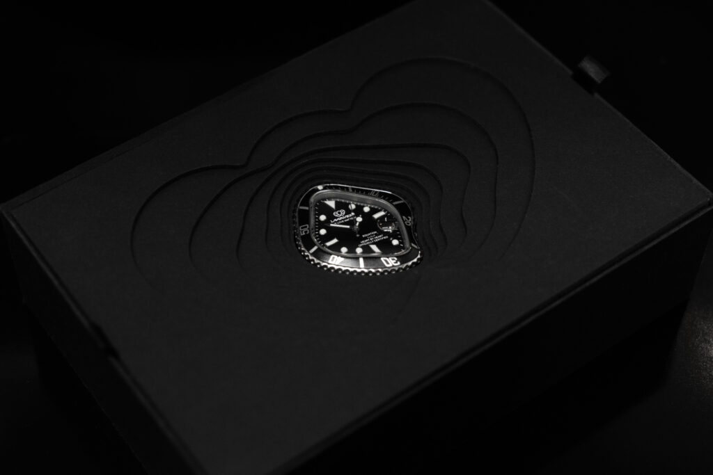
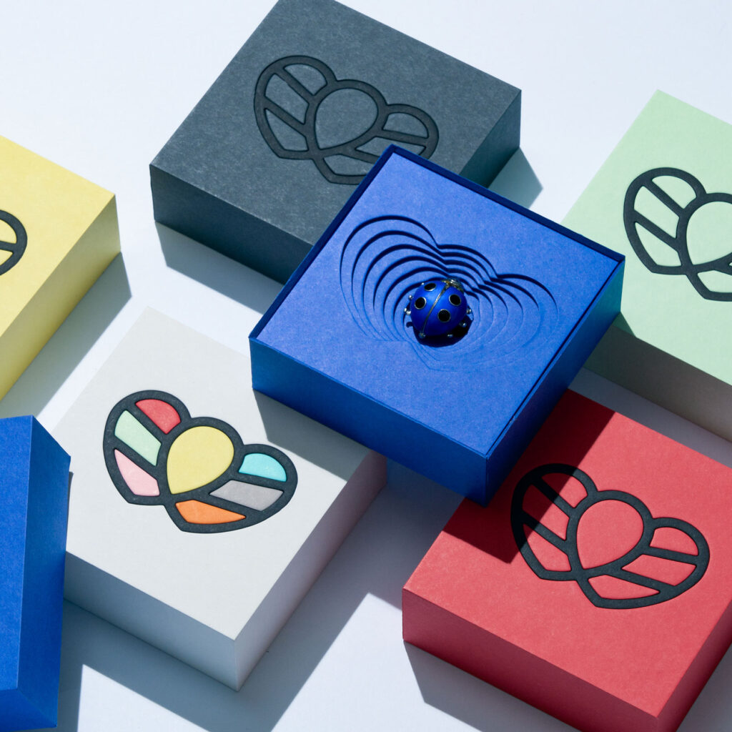
The black box features razor sharp angles and comes in its purest form, giving a raw, authentic texture, without the need for paper covering.
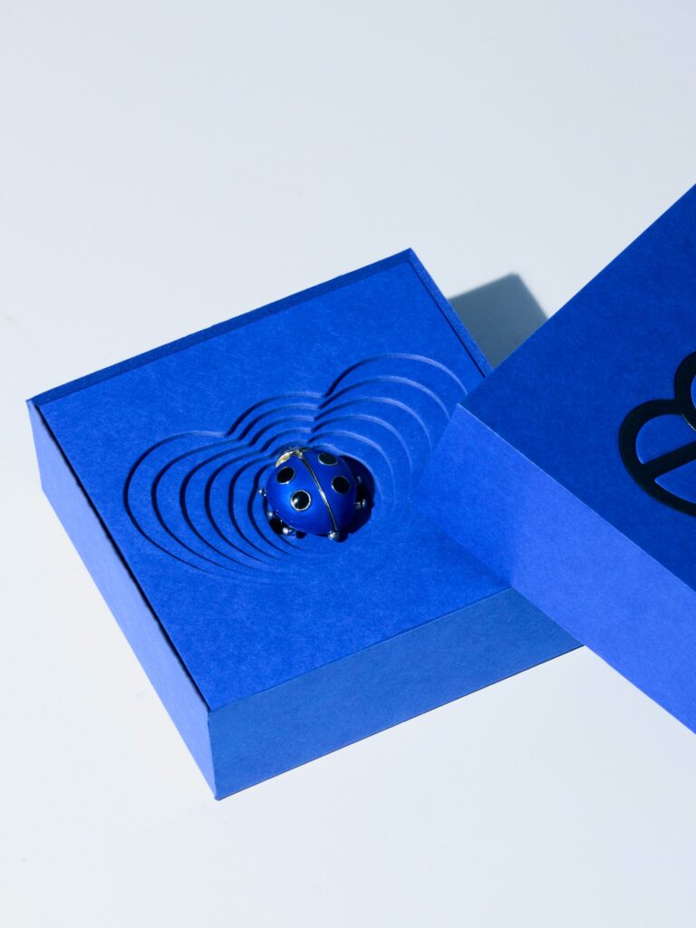
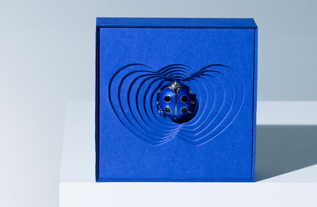
The unique multi-layer structure embedded in the blue box gives the board a 3D effect, displaying a ladybug-shaped piece of jewellery, serving as both protection and presentation perfection.
Lucky recipients of either box will discover a whole world of love; layer upon layer of interlocking hearts, pleasing to the eye, creating wonder in the mind and excitement in the surprise.
The contrast between the board and the metal of the watch only adds to the aesthetic adventure unleashed.
What’s inside the box?
As is always with ESKA, the end user is front of mind.
When gifting, it’s all about the anticipation, excitement unfolding. ESKA and Pangolin have seamlessly and elegantly created the ultimate gifting experience for a loved one to unbox.
Ethical and utterly beautiful
Laarvee, Pangolin and ESKA all have one thing in common. Their commitment to sustainability in pioneering the luxury packaging market. Choosing recyclable materials such as ESKA Colours, combining innovative design techniques and doing the right thing, time and time again.
Every detail deliberated
And deep dive into the world of design with Pangolin’s head designer, LOW Sek-vai…
Name your main source of inspiration when designing Laarvee’s packaging?
Simple. It was Laarvee’s own philosophy where tradition meets modernity. We took sustainable materials and applied innovative design techniques, merging old with new.
Did the material influence the creative process?
Absolutely. ESKA BLUE played a crucial role in the design.
The rich hue of ESKA BLUE highlights the colours of cloisonné craftsmanship in jewellery. What’s more, when layered, ESKA board presents a 3D effect, almost origami-like in its intricacy and delicacy.
ESKA BLUE is deep and pure: perfect for pairing with metallic ornaments. Under the light, the reflection of the cardboard surface contrasts strongly with the gleam of the metal, creating a mesmerising effect, like “paper drunk on gold,”.
A dreamy moment in time as the two materials complementing each other.
Take five
Did you discover anything new while working with ESKA BLUE?
Usually, the biggest challenge in design engineering lies in the adhesive technique after cutting the cardboard at an angle. We’ve found that using a 46-degree (instead of the conventional 45-degree) blade for the bevel cut on the edge of the cardboard gives the best results.
In this design, the most exciting aspect is the purity of the material used. In past projects, achieving similar colours across different materials has been a problem as texture and structure often cannot be matched.
With ESKA BLUE, the board not only meets the requirements for the exterior of the box but also fulfils the layering of the internal decorative design. This gives the overall packaging a unified blue colour.
![4:3 [已恢复]-39WEBCARD](https://eska.com/wp-content/uploads/2024/07/4:3-已恢复-39WEBCARD.jpg)
Describe your creative process…
When designing, we have lots of good ideas. But when it comes to production, we can face barriers to our preferred creative choices.
We believe that creativity needs layers.
Like the French dessert, macaroon. Some flavours surprise people with their layers of taste. When the tongue touches the food, it may taste sweet, but when swallowed, there may be a little bit of lemon acidity left in the mouth.
It’s precisely that element of surprise that we pursue in our designs.
It’s called a 1+1=1 technique and is based on generalisation. We apply this logic to our packaging design, creating layers that add depth and dimension.
LAARVEE also uses this logic to make jewellery and watches, making this project a perfect match.
Before opening the lid, the brand logo is simply nested on the board, encapsulating the core image in its purest form.
When the box is opened however, the recipient discovers that directly underneath the logo on the lid, the same logo appears in the exact same position underneath, not as a flat graphic, but rather a 3D structure that sinks down layer by layer, finally wrapping around the jewellery inside.
Timeless product, timeless packaging using timeless material. Who could ask for more?
Presenting our box of ESKA BLUE is so exciting for us.